Scale Conservation. Reduce Complexity. Demonstrate Impact.
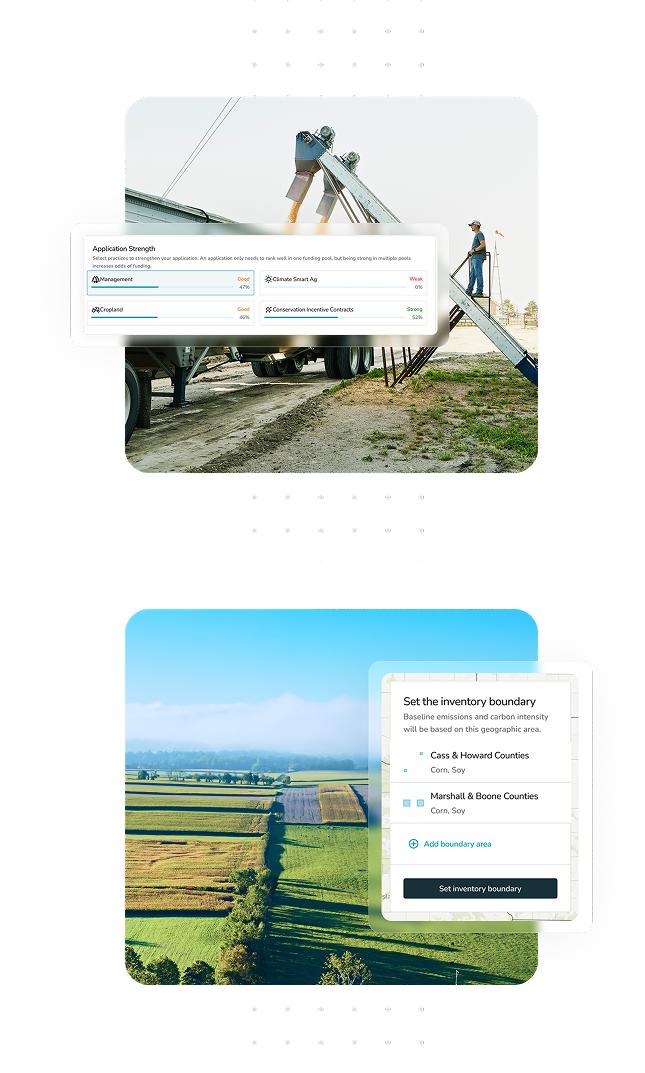
Run agriculture programs at scale—efficiently and effectively. The CIBO platform streamlines program management, enables incentive stacking, scales access to acres and expertise, and delivers real-time impact measurement so you can deploy funds efficiently, reduce internal complexity, and demonstrate financial and environmental results with confidence.
.png?width=93&height=60&name=thedelongco%202%20(1).png)
.png?width=1240&height=60&name=logos%20(1).png)
.png)
Efficiently manage your sustainability programs.
CIBO’s platform is built on advanced science and uses state-of-the-art technologies to design, deploy, qualify, quantify, verify and report. Fully automate processes and configure programs to efficiently execute and measure the impact of your programs at scale.
Streamline Program Management
Our configurable program engine supports any sustainability program. Efficiently design and deploy programs and get rapid program matching, pre-qualification and enrollment.
Scale Acres & Expertise
CIBO’s software-enabled grower network powers acre sourcing and scalability with more than 100 million acres available in-platform making it easy to find, engage and pay farmers.
Combine Public & Private Funds
CIBO enables the blending of public and private funds, which catalyzes program adoption and maximizes the impact of every dollar deployed.
Deliver Credible Modeling & Impact Reporting
CIBO delivers precise tracking, quantification and verification of practices along with rigorous impact reporting aligned with the newest standards and protocols.

Tailored solutions to meet your needs.
Reduce internal development costs, scale your offering and meet reporting needs.
Deploy programs, source growers, combine with public funds and hit Scope 3 goals.
Identify and source desired feedstocks, calculate feedstock CI score and report outcomes.
Scale programs, reduce costs, supplement incentives and ensure high quality impact quantification and reporting.
Streamline program deployment, reduce processing costs and enhance planners’ outcomes.
Drive execution of Scope 3 strategies, monitor and validate impact and generate revenue.